Reference: branding for a sustainability consultancy

Branding for a sustainability consultancy: 36° sustainability.

36° sustainability advises companies on sustainable transformation. OSTWERK developed the existing 36° brand further: logo, colour palette, typography and a brand book, in about seven weeks.

A project by OSTWERK, digital agency in Vienna.

Orange 36° sustainability brochure lying on plants

At a glance

The 36° sustainability branding at a glance.

The degree sign becomes a wordmark that shows precision and responsibility and can be extended for further brands.

Client
ThirtySix Degrees Sustainability Consulting GmbH
Industry
Consulting for sustainability and ESG
Services
Logo, typography, colour palette, brand book, logo case
Period
March to April 2025, about seven weeks
Typeface
Raleway

Starting point

How does a logo become a brand for a growing consulting team?

What we delivered.

  • The 36° logo and a corporate design manual already existed.Logo: the wordmark "36° sustainability" with the dot as a closing element, derived from the degree sign.
  • The brand should build on that and still feel more grown-up and clearer.Colour palette: jade green and lilac, with coral red as the contrast colour.
  • Several consultants bring their own focus areas, a shared frame was missing.Typeface: Raleway as the house typeface.
  • Later, further brands should be derivable from the main brand.Rules: brand book and logo case in CMYK and RGB.

Build

Three decisions behind the brand.

  1. Five logo variants started from the degree sign. The choice fell on the variant with a coloured dot. The dot derives from the ° and closes the wordmark.

  2. Jade green and lilac carry the brand. The original coral red stayed as the contrast. The colours were checked for readable contrast.

  3. Raleway was the house typeface. For "sustainability" the typeface was tuned so that the word fits the round shape of the "36°".

Project timeline

In seven weeks from idea to brand book.

  1. Concept

    At the start of March 2025 the project begins with the brand idea and tone.

  2. Drafts

    Three brand identity variants, then five logo variants, with client feedback in between.

  3. Decision

    At the start of April the decision is made for logo and colour palette.

  4. Handover

    At the end of April 2025 brand book and logo case are ready.

Result

The 36° logo has become a brand that serves as a frame for a growing consulting team.

  • Wordmark, colour palette and typeface as a system
  • Brand book and logo case in CMYK and RGB
  • Extendable for further brands

Client voice

The OSTWERK team developed the brand identity of 36 sustainability with and for us, creative, fast and with a real feel for our vision.
Roman MesicekPartner, 36° sustainability

FAQ

Frequently asked questions about the project.

What did OSTWERK do for 36° sustainability?

OSTWERK developed the existing 36° brand further: wordmark with "sustainability", colour palette, typography, brand book and logo case.

How long did the project take?

About seven weeks, from the confirmation of the quotation at the start of March 2025 to the handover of the brand book at the end of April 2025.

What does the dot in the logo stand for?

It derives from the degree sign and closes the wordmark. The ° stands for precision, direction and a global perspective.

Can the brand be extended?

Yes. The set of rules is built as a foundation from which further brands can be derived later.

More references

More brands by OSTWERK.

3 Projekte

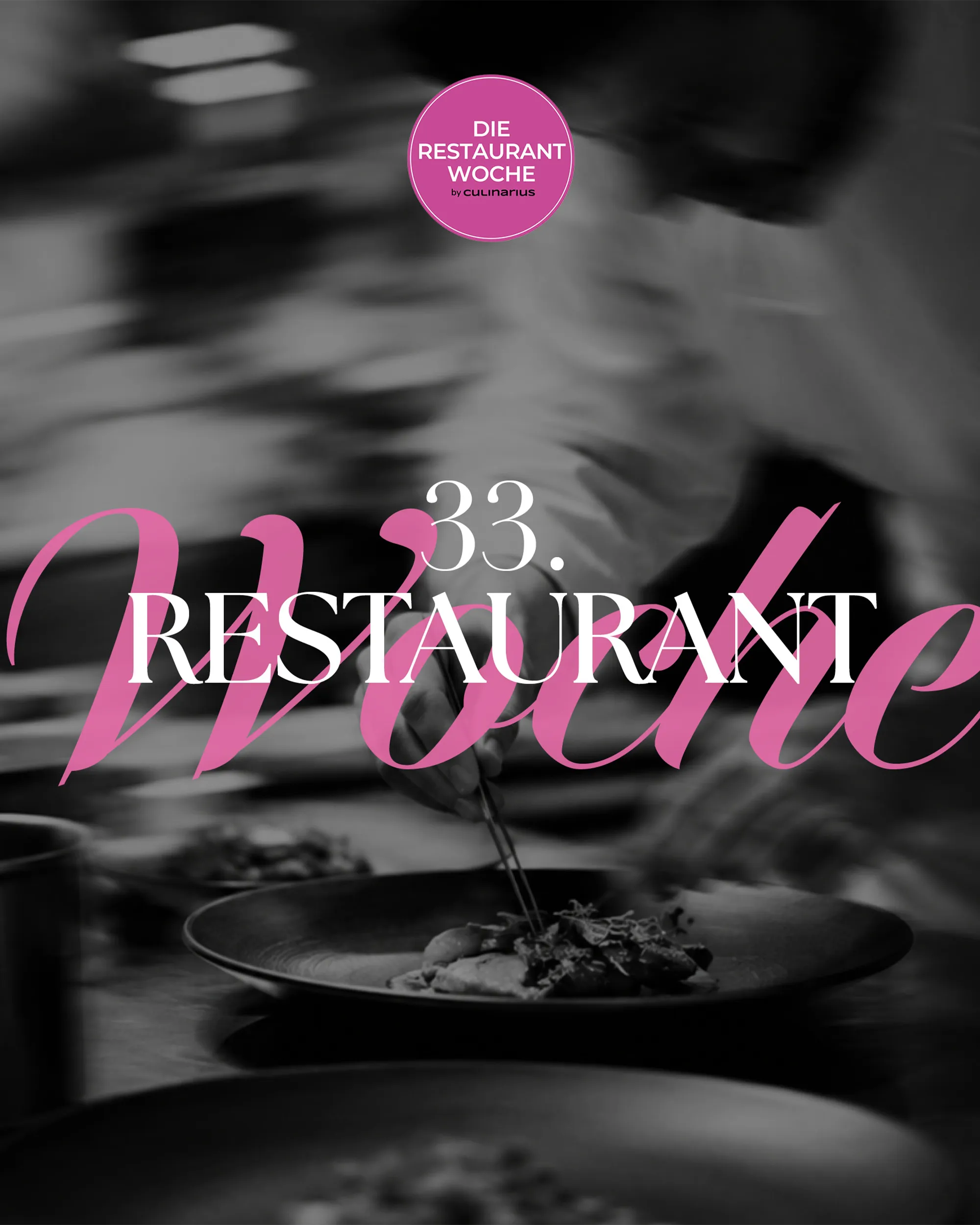
  • Schwarz-weißes Foto eines Kochs beim Anrichten mit dem Schriftzug Die Restaurantwoche, Web-Projekt von OSTWERK

    [WEB][TECHNOLOGY & MEDIA]

    Die Restaurantwoche

    Ausgangslage
    Viele Gäste sollen in einer Genusswoche gleichzeitig reservieren, ohne Doppelbuchungen.
    Ergebnis
    Eigenes Reservierungssystem mit Frühbucher-Logik, Mails und SMS, drei Editionen seit 2025.
    Case ansehen: Die Restaurantwoche
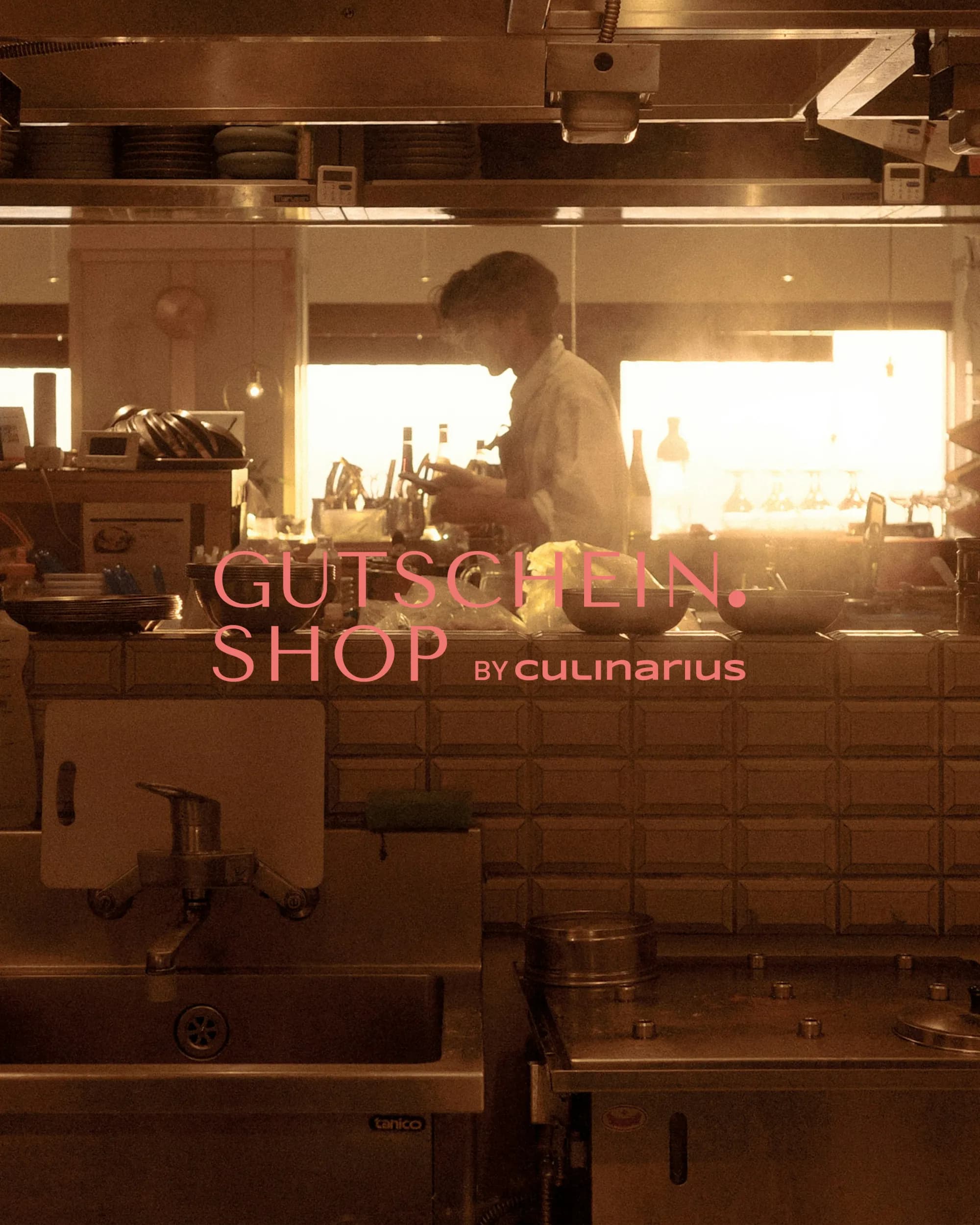
  • Koch in einer Restaurantküche im Gegenlicht mit dem Logo Gutschein.Shop by Culinarius

    [WEB][TECHNOLOGY & MEDIA]

    Gutschein.Shop

    Ausgangslage
    Ein laufender Gutscheinshop braucht Stabilität und eine Struktur, die in der Suche gefunden wird.
    Ergebnis
    Übernahme und Betreuung seit Oktober 2025, neue URL-Struktur nach Region und Gutscheinart.
    Case ansehen: Gutschein.Shop
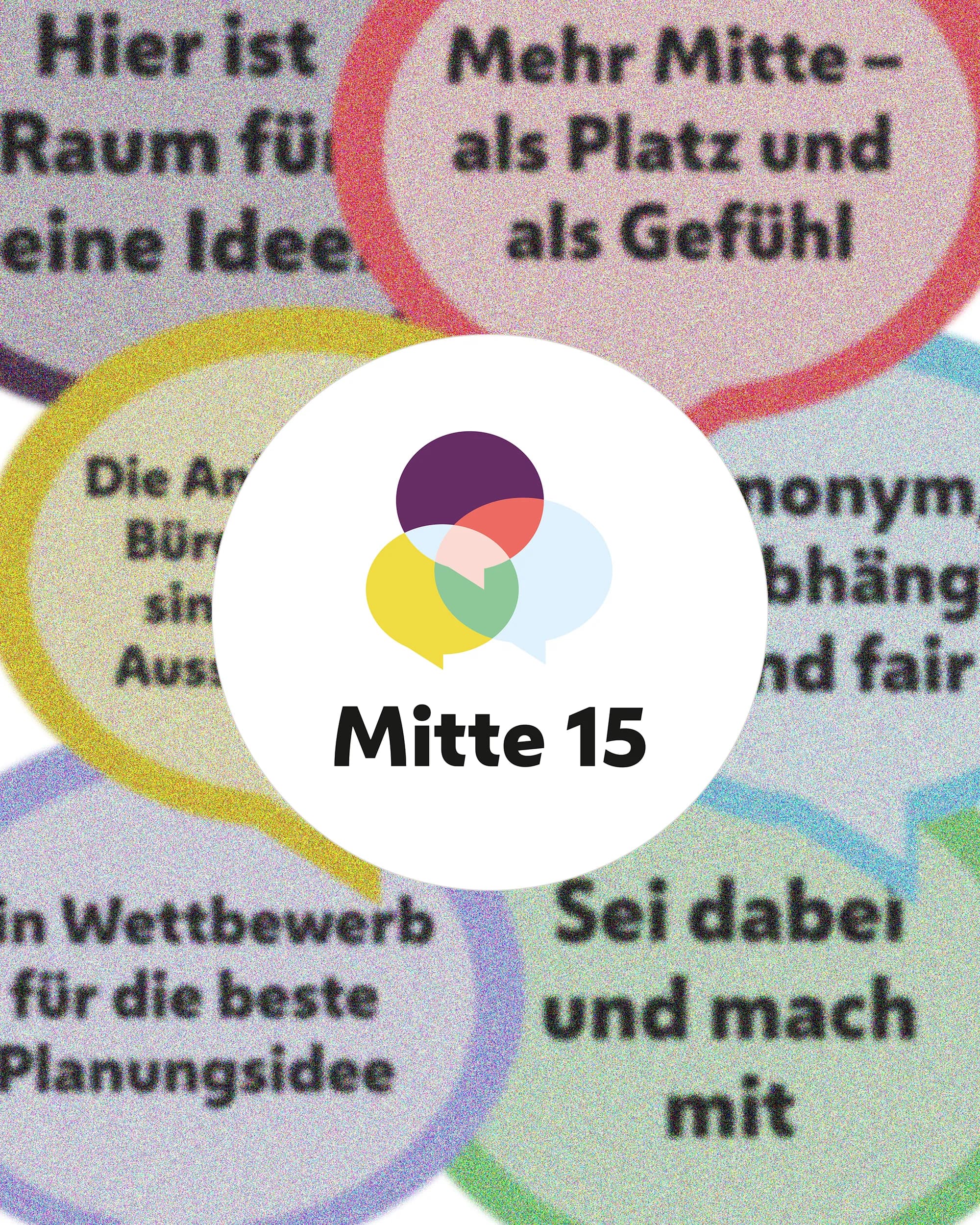
  • Bunte Sprechblasen mit Beteiligungsaussagen um das Logo von Mitte 15, Web-Projekt von OSTWERK

    [WEB][PUBLIC & INSTITUTIONS]

    Mitte 15

    Ausgangslage
    Wettbewerb und Beteiligung sollen für alle Bewohner:innen verständlich und auffindbar sein.
    Ergebnis
    Statische Projektwebsite mit CMS, laufend betreut, dazu Print-Material für den Auftakt.
    Case ansehen: Mitte 15

Next step

A brand that can grow with your team?

Tell us what it is about. We reply within 24 hours.