Reference: branding for a real estate agency

Branding for real estate in Vienna: Timeless Estates.

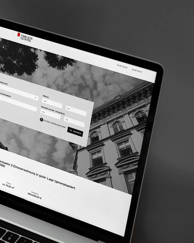
VM Estates became Timeless Estates. OSTWERK repositioned the brand: name, logo, colour palette, brand book and image concept, plus design and concept of the website.

A project by OSTWERK, digital agency in Vienna.

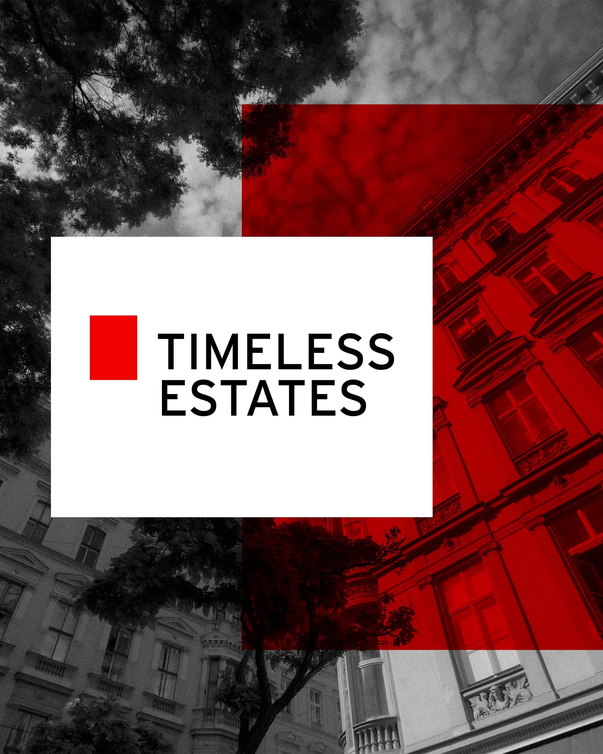
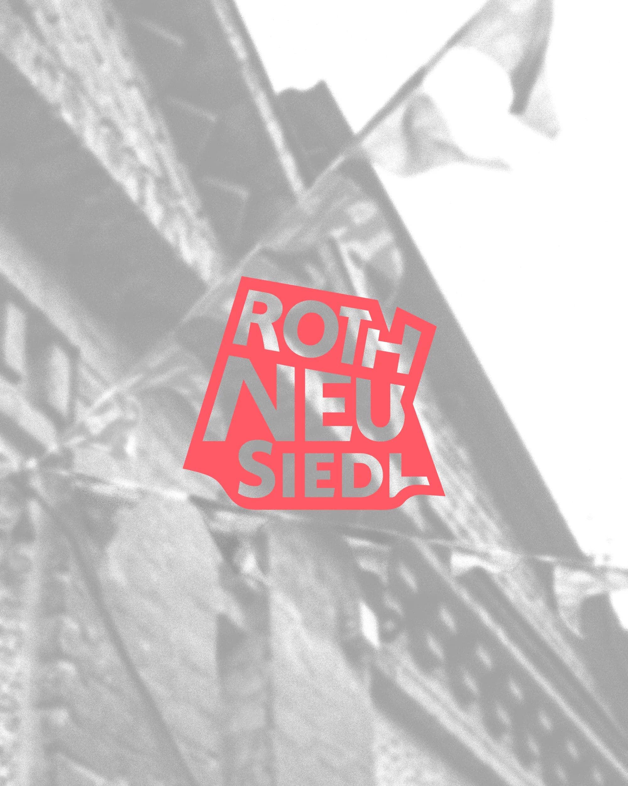
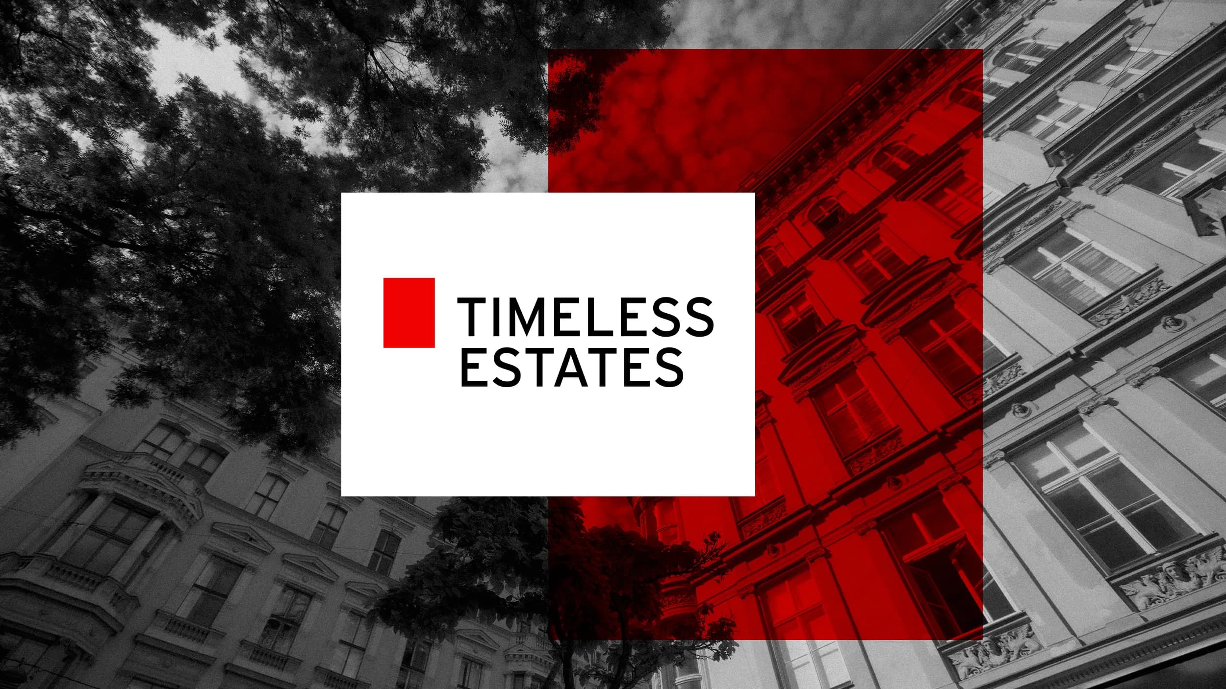
Timeless Estates logo on a red, black and white building facade

At a glance

The Timeless Estates branding at a glance.

Red, black and white, a striking rectangle as a style element and a look that radiates permanence.

Client
Timeless Estates, VM-Estates GmbH, Vienna
Industry
Real estate agency, sales, purchase and rental
Services
Naming, logo, corporate design, brand book, image concept, social media strategy, website design and concept
Period
since 2022
Website implementation
JustImmo, provider of the agency software

Starting point

How does a founders' name become a brand with permanence?

What we delivered.

  • The company was named after the founders' surnames, the name said nothing about its attitude.Name: from three directions, "Timeless Estates" was chosen.
  • The red of "Red Vienna" as a value was to stay.Look: red, black and white with a striking rectangle as a style element.
  • The look should radiate trust, permanence and partnership.Imagery: photo concept with real scenes from everyday agency life.
  • The website ran on the agency software, with technical limits.Website: design and concept within the possibilities of the agency software.

Build

Four decisions behind the brand.

  1. Three directions were on the table. "Timeless Estates" became the favourite: a name for permanence and values that last.

  2. The red picks up on Red Vienna. Clear, geometric shapes and the rectangle as a recurring element make the brand recognisable, right down to large surfaces such as tarpaulins and signs.

  3. The website sits on the agency software of JustImmo. OSTWERK designed the layout and concept, JustImmo implemented it technically. The result uses the possibilities of the system without hiding its limits.

  4. The property search is the central entry point, with filters for type of marketing, property type, price and area.

Project timeline

From naming to the website.

  1. Branding feedback

    In March 2022 three brand directions are discussed, the choice falls on Timeless Estates.

  2. Brand book

    In April 2022 follows the handover of the brand book with logo variants and image concept.

  3. Social media

    Strategy and editorial plan for Instagram, Facebook and LinkedIn.

  4. Website

    Design and concept are created in coordination with JustImmo, the provider implements the website.

Result

Timeless Estates has a distinctive brand that stays recognisable from the logo to the website.

  • New name, logo and corporate design
  • Brand book with image concept
  • Website design and concept
  • Business cards and social media strategy

Client voice

Working with Ostwerk was more than just business. It was sympathy, being understood and friendship.
Stefan VettingerManaging Director, Timeless Estates
Stefan Vettinger, Managing Director of Timeless Estates

FAQ

Frequently asked questions about the project.

What did OSTWERK do for Timeless Estates?

OSTWERK developed the brand: naming, logo, corporate design, brand book and image concept, plus design and concept of the website and a social media strategy.

Who programmed the website?

JustImmo, the provider of the agency software the website runs on. OSTWERK delivered design and concept.

Why red?

The red picks up on Red Vienna and was to stay as a value of the brand. With black and white it forms a clear triad.

Since when has OSTWERK worked for Timeless Estates?

Since 2022. The branding was followed by social media strategy, website design and later business cards.

More references

More brands by OSTWERK.

3 Projekte

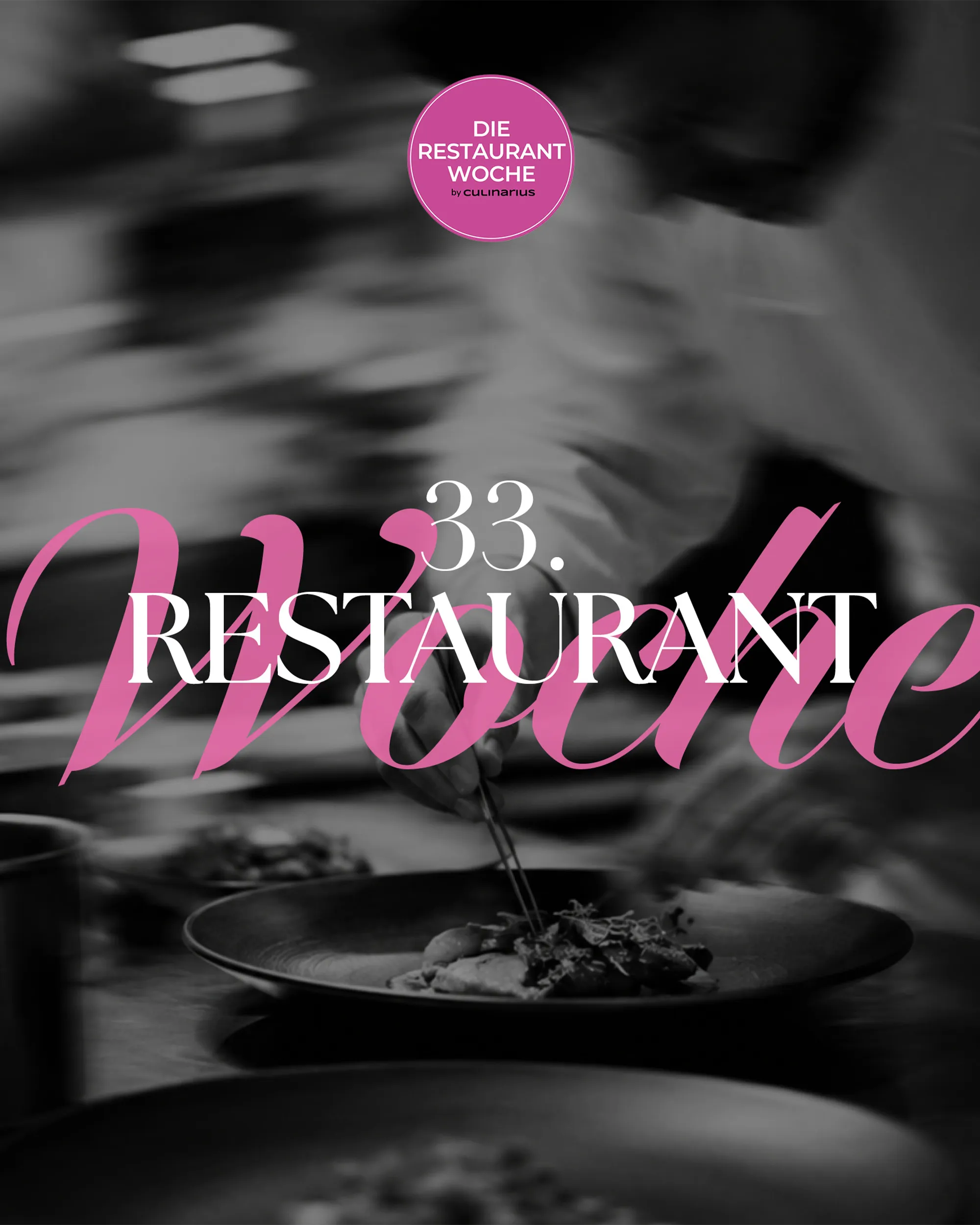
  • Schwarz-weißes Foto eines Kochs beim Anrichten mit dem Schriftzug Die Restaurantwoche, Web-Projekt von OSTWERK

    [WEB][TECHNOLOGY & MEDIA]

    Die Restaurantwoche

    Ausgangslage
    Viele Gäste sollen in einer Genusswoche gleichzeitig reservieren, ohne Doppelbuchungen.
    Ergebnis
    Eigenes Reservierungssystem mit Frühbucher-Logik, Mails und SMS, drei Editionen seit 2025.

    Case ansehen: Die Restaurantwoche
  • Koch in einer Restaurantküche im Gegenlicht mit dem Logo Gutschein.Shop by Culinarius

    [WEB][TECHNOLOGY & MEDIA]

    Gutschein.Shop

    Ausgangslage
    Ein laufender Gutscheinshop braucht Stabilität und eine Struktur, die in der Suche gefunden wird.
    Ergebnis
    Übernahme und Betreuung seit Oktober 2025, neue URL-Struktur nach Region und Gutscheinart.
    Case ansehen: Gutschein.Shop
  • Bunte Sprechblasen mit Beteiligungsaussagen um das Logo von Mitte 15, Web-Projekt von OSTWERK

    [WEB][PUBLIC & INSTITUTIONS]

    Mitte 15

    Ausgangslage
    Wettbewerb und Beteiligung sollen für alle Bewohner:innen verständlich und auffindbar sein.
    Ergebnis
    Statische Projektwebsite mit CMS, laufend betreut, dazu Print-Material für den Auftakt.
    Case ansehen: Mitte 15

Next step

A brand that stands out in a similar market?

Tell us what it is about. We reply within 24 hours.