Reference: branding for a mentoring programme

Branding for mentoring in Vienna: younus.

younus accompanies children, young people and families with volunteer mentors. OSTWERK developed the brand in 2023: name, logo, typeface, colour palette and wording, plus a brand handbook.

A project by OSTWERK, digital agency in Vienna.

younus logo above a woman helping a child draw

At a glance

The younus branding at a glance.

A brand that expresses openness and community, in a colour palette between Algal Green and Lavender.

Client
younus Mentoring, Vienna
Industry
Non-profit organisation, mentoring
Services
Naming, logo, typography, colour palette, look and feel, wording, brand handbook
Period
2023
Format
Workshop, two logo directions, brand handbook

Starting point

How does a programme become a brand with a sense of community?

What we delivered.

  • The organisation needed a new brand and a new name.Name: "younus", the fusion of "you" and "us".
  • The diversity of people was to be at the centre, including the mentoring with parents.Logo: typographic glyphs that form a harmonious whole.
  • The look should feel open and approachable, not like an official letter.Typeface: Ubuntu, open and freely available.
  • The brand's imagery should move away from the stock-photo look towards real people.Colour palette: from Algal Green to Lavender, with plenty of white space.
  • A small team must be able to apply the brand in everyday work without a designer.Handbook: brand handbook and workshop for the application.

Build

Three decisions behind the brand.

  1. "younus" combines "you" and "us". This stands for the collaboration between mentor and mentee.

  2. Typographic glyphs together form the logo, the "u" acts as a connecting element. Two directions were presented with application examples, and the decision was made together.

  3. Ubuntu as the house typeface is open and freely usable, which fits the organisation's attitude. The colour palette is light and leaves room for real photos.

Project timeline

From the idea to the brand.

  1. Workshop

    Together, attitude, audiences and ambition are sharpened.

  2. Two directions

    OSTWERK presents two logo directions with application examples and collects feedback.

  3. Brand

    Name, logo, typeface, colour palette, look and feel and wording are finalised.

  4. Handbook

    The brand handbook and the logo files make the brand usable in everyday work.

Result

younus has a brand that has been in use since 2023 and continues to be expanded.

  • New brand with name, logo, typeface and colour palette
  • Brand handbook and logo files in use
  • Extended in 2026 by a "Mentoring" variant

FAQ

Frequently asked questions about the project.

What did OSTWERK do for younus?

OSTWERK developed the brand in 2023: naming, logo, typography, colour palette, look and feel and wording, plus a workshop and a brand handbook.

How did the name come about?

"younus" combines "you" and "us". The name stands for the connection between mentor and mentee.

Why Ubuntu as the typeface?

Ubuntu is an open typeface that can be used freely. This fits the organisation's attitude.

Did OSTWERK also build the younus website?

No. The younus website was built by another agency. OSTWERK developed the brand.

More references

More brands by OSTWERK.

3 Projekte

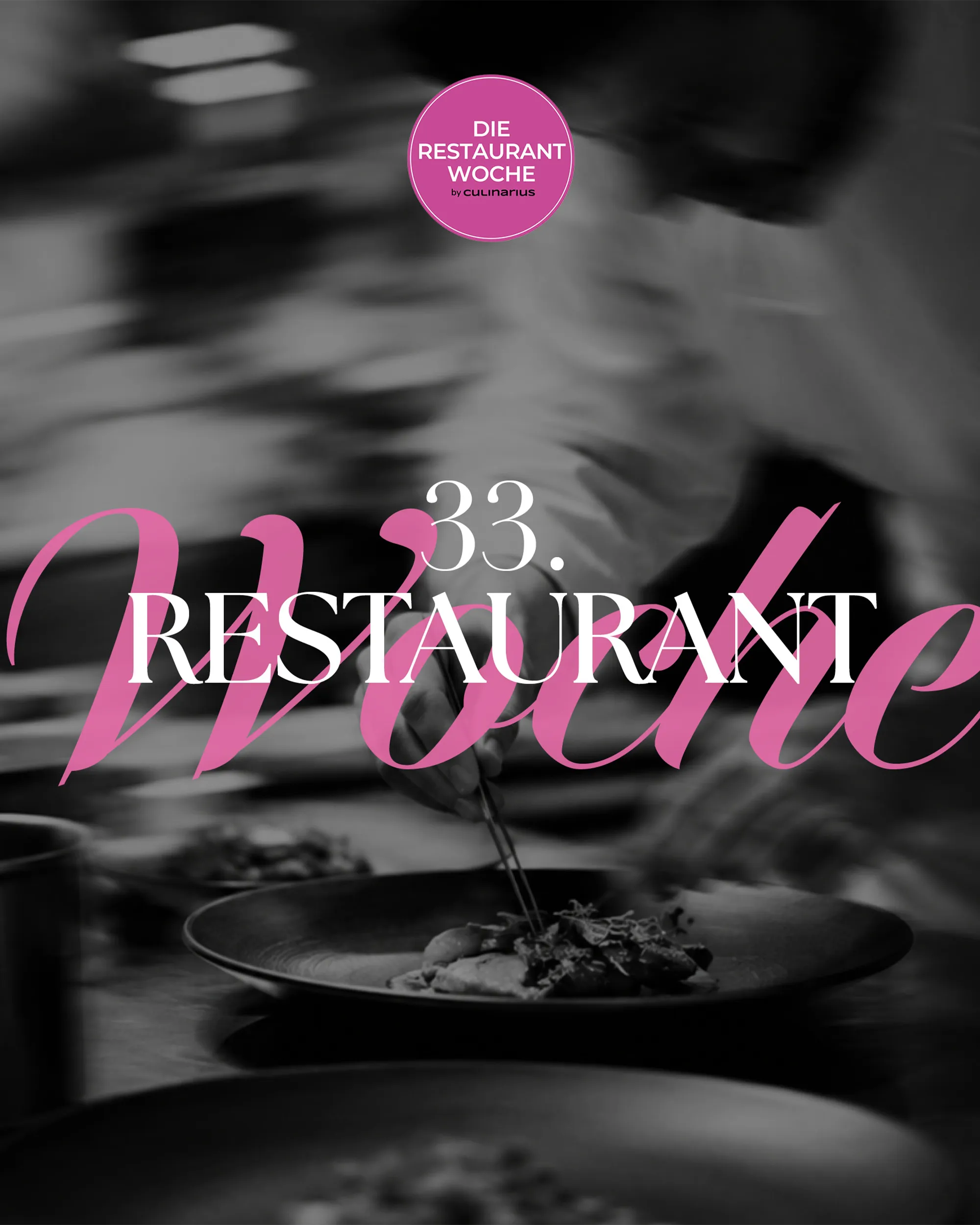
  • Schwarz-weißes Foto eines Kochs beim Anrichten mit dem Schriftzug Die Restaurantwoche, Web-Projekt von OSTWERK

    [WEB][TECHNOLOGY & MEDIA]

    Die Restaurantwoche

    Ausgangslage
    Viele Gäste sollen in einer Genusswoche gleichzeitig reservieren, ohne Doppelbuchungen.
    Ergebnis
    Eigenes Reservierungssystem mit Frühbucher-Logik, Mails und SMS, drei Editionen seit 2025.
    Case ansehen: Die Restaurantwoche
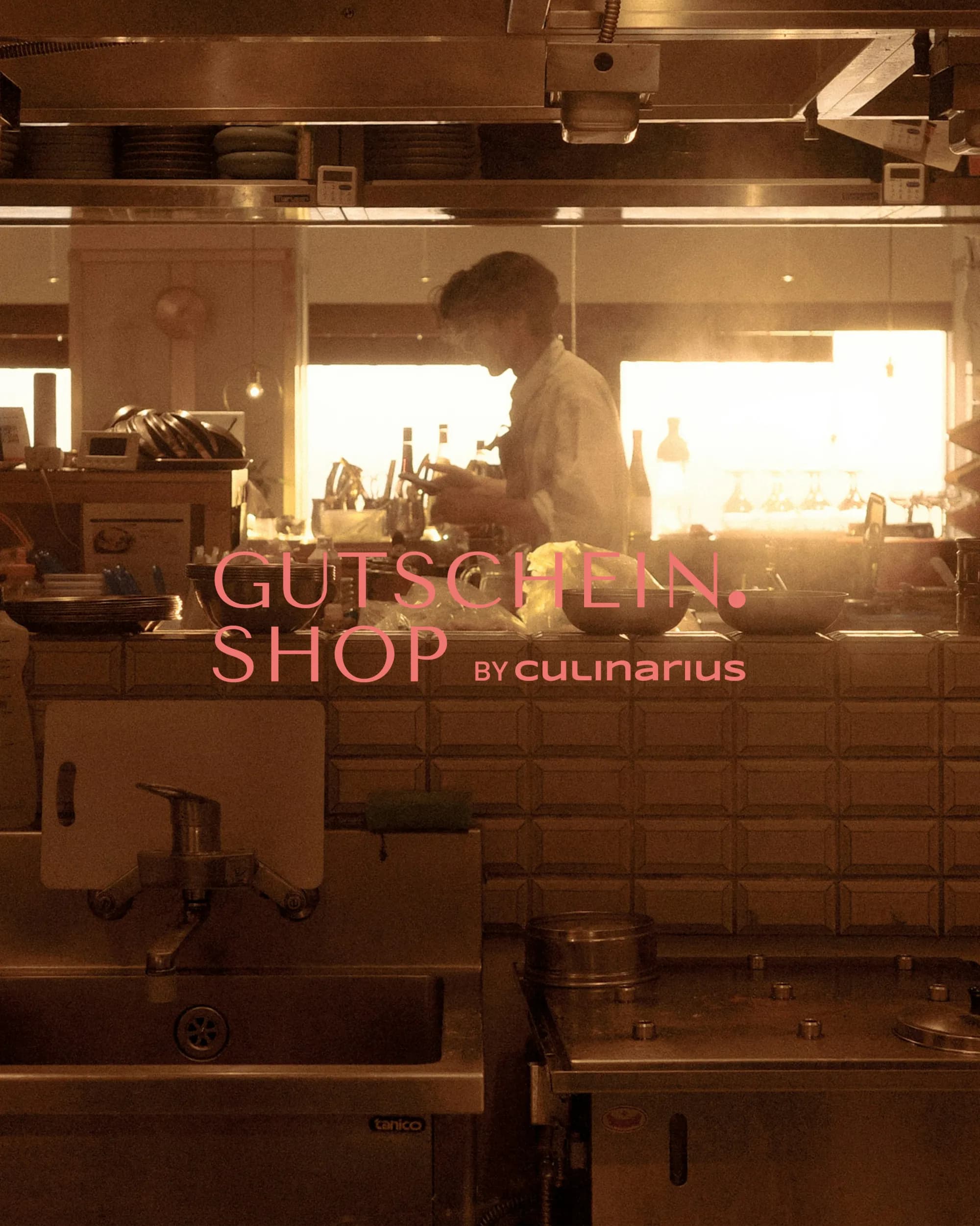
  • Koch in einer Restaurantküche im Gegenlicht mit dem Logo Gutschein.Shop by Culinarius

    [WEB][TECHNOLOGY & MEDIA]

    Gutschein.Shop

    Ausgangslage
    Ein laufender Gutscheinshop braucht Stabilität und eine Struktur, die in der Suche gefunden wird.
    Ergebnis
    Übernahme und Betreuung seit Oktober 2025, neue URL-Struktur nach Region und Gutscheinart.
    Case ansehen: Gutschein.Shop
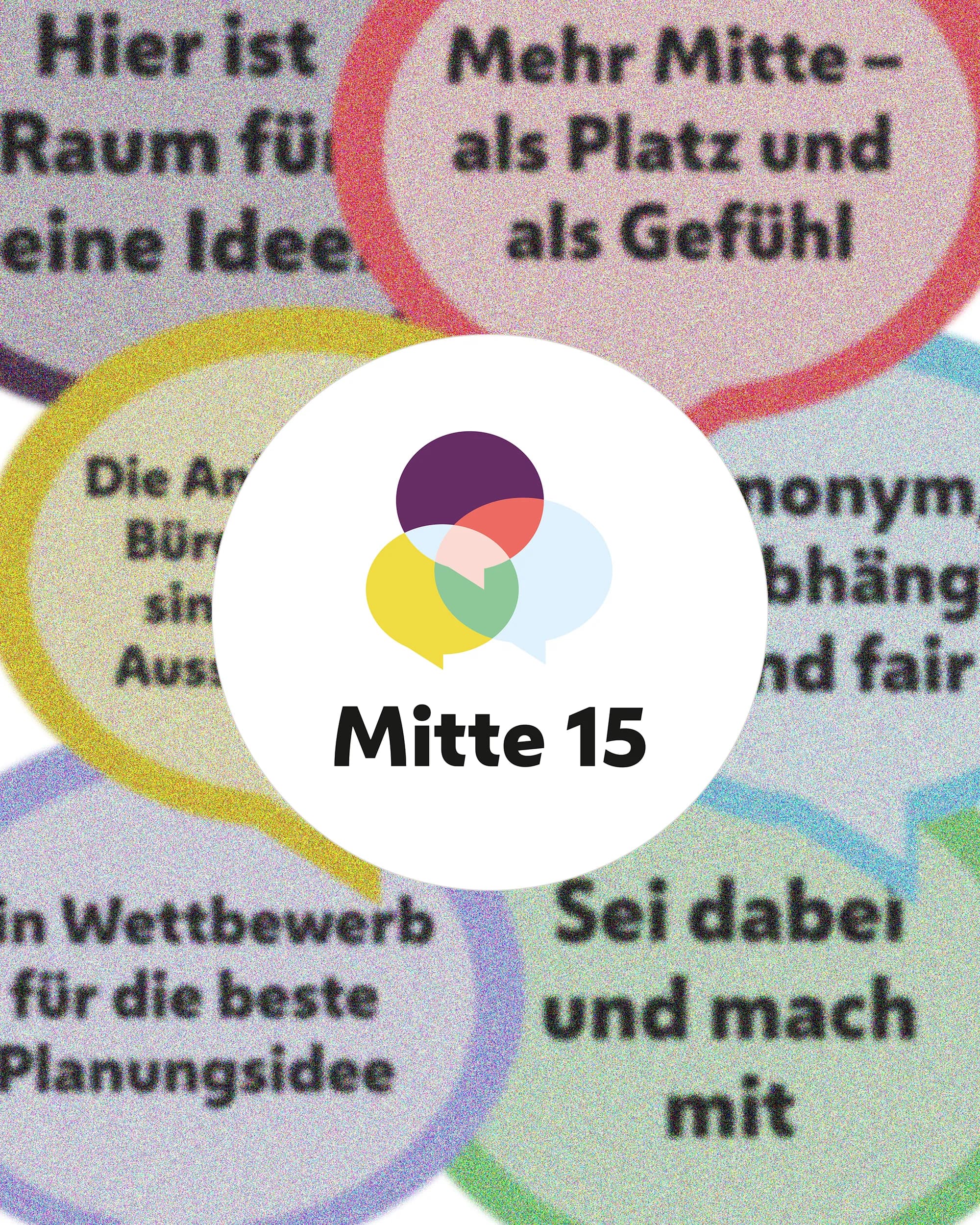
  • Bunte Sprechblasen mit Beteiligungsaussagen um das Logo von Mitte 15, Web-Projekt von OSTWERK

    [WEB][PUBLIC & INSTITUTIONS]

    Mitte 15

    Ausgangslage
    Wettbewerb und Beteiligung sollen für alle Bewohner:innen verständlich und auffindbar sein.
    Ergebnis
    Statische Projektwebsite mit CMS, laufend betreut, dazu Print-Material für den Auftakt.
    Case ansehen: Mitte 15

Next step

A brand for something that connects people?

Tell us what it is about. We reply within 24 hours.