Reference: branding for a city district

Branding for a city district in Vienna: RothNEUsiedl.

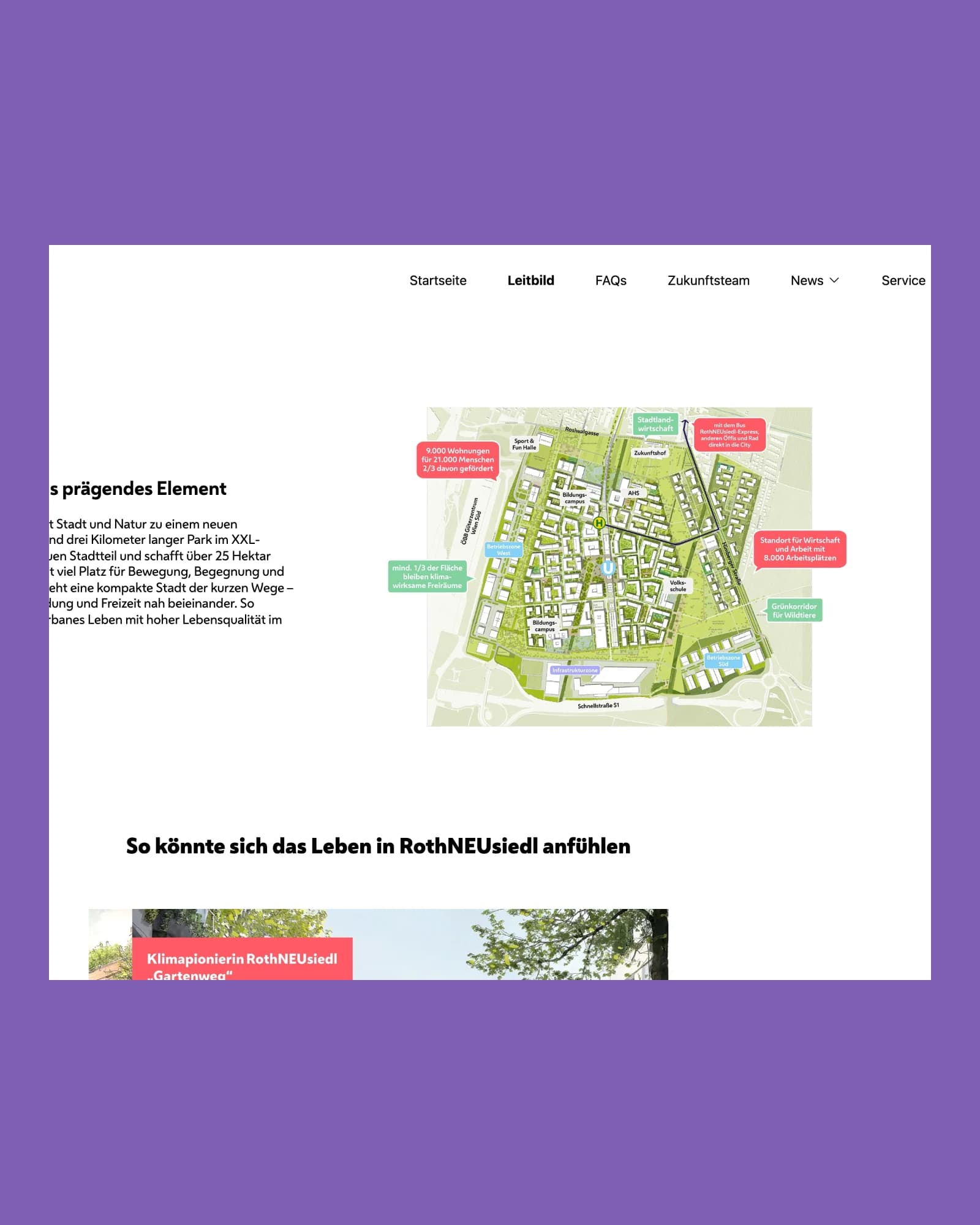
In Rothneusiedl, a climate-friendly district for over 21,000 people is being built on 124 hectares. OSTWERK developed the identity together with clavis: logo, colour palette and illustrations that carry from the website to the sign on site.

A project by OSTWERK, digital agency in Vienna.

Red RothNEUsiedl logo in front of a building facade in black and white

At a glance

The RothNEUsiedl branding in facts and figures.

A sub-brand of the City of Vienna for a district that does not yet exist: logo, colour palette, illustrations and a look that connects print, outdoor and digital.

Client
City of Vienna, Urban District Planning and Land Use (MA 21A)
Together with
clavis Kommunikationsberatung
Industry
Urban development
Services
Branding, corporate design, illustration, print and outdoor, website
Period
since 2022, continuously supported
Tech
WordPress, Adobe Creative Cloud

Starting point

How do you give a district that does not yet exist an identity?

What we delivered.

  • The district does not exist yet, the brand has to make it visible.Identity: a logo derived from the area's footprint, with "NEU" (new) highlighted.
  • The brand of the City of Vienna sets the frame.Embedding: sub-brand of the City of Vienna, with the dawn red as the colour line.
  • Future residents and the Viennese population want to be informed.Imagery: illustrations with scenes of future everyday life.
  • The vision must be recognisable in public space and online.Consistency: the same line on signs, material, website and social media.
  • The look should last for years, not just for the start.Foundation: a basis for long-term communication.

Build

Six decisions that make the brand.

  1. The logo is derived from the footprint of the project area. Highlighting "NEU" emphasises the change and the future of the district.

  2. As a sub-brand of the City of Vienna, RothNEUsiedl relies on the city's dawn red as the colour line. This creates recognition in public space.

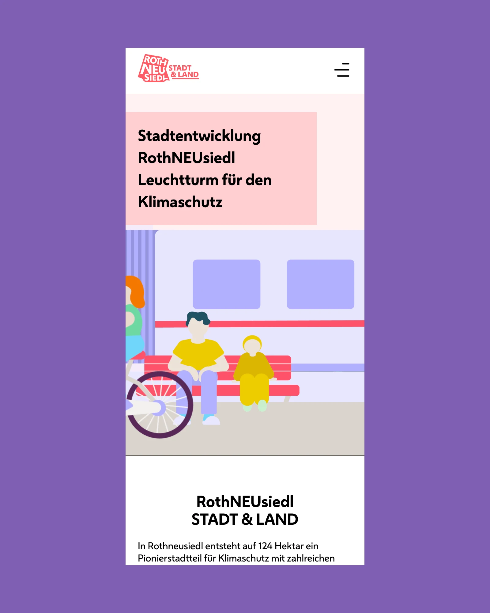
  3. Specially developed illustrations show scenes of future everyday life in the new district, for print, outdoor advertising and digital.

  4. Information media and event material on site, website and social media assets follow the same visual line.

  5. The website is inviting, inclusive and easy to navigate, with animated illustrations and interactive modules.

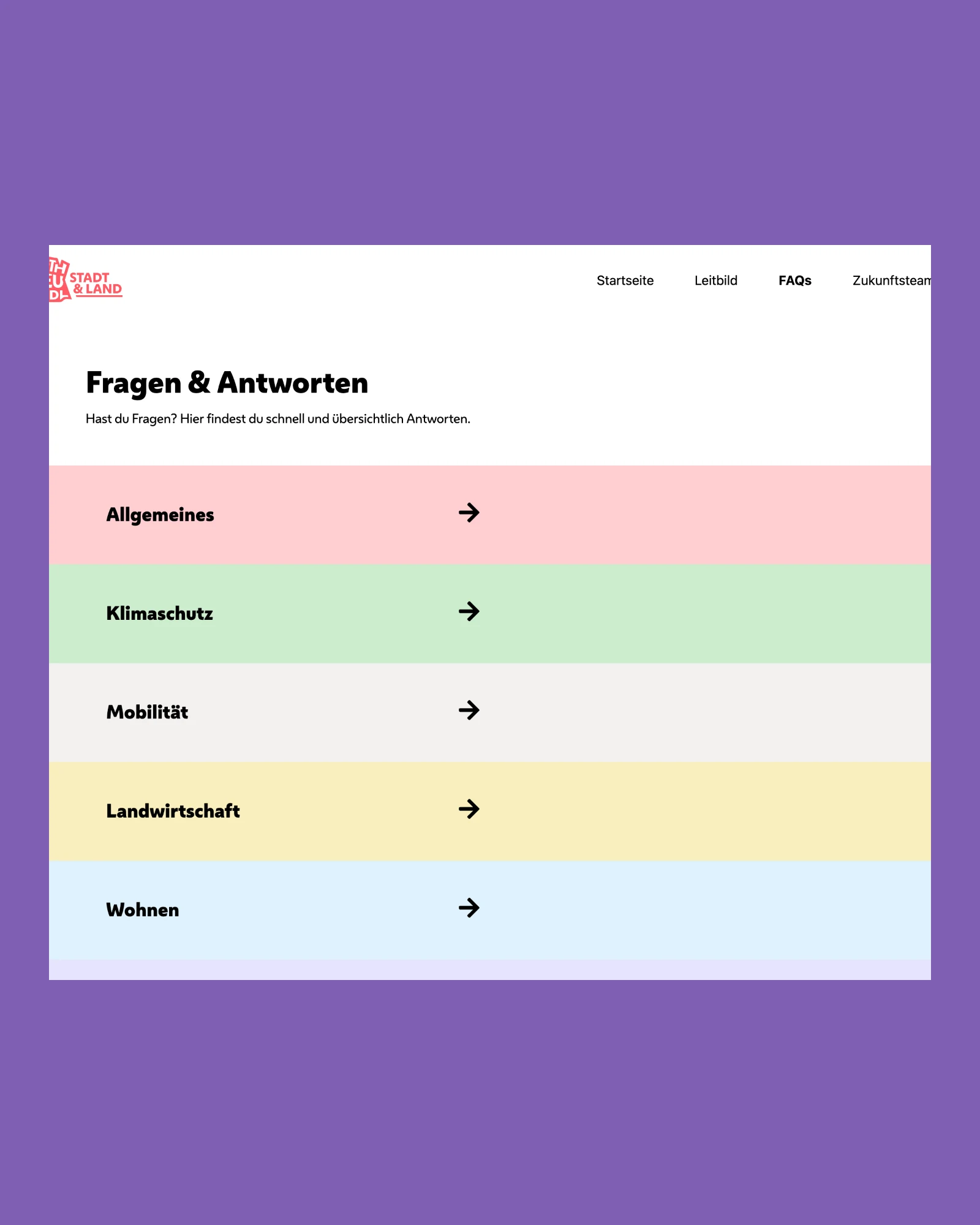
  6. Mission statement, maps and FAQs make the state of planning understandable for citizens.

Project timeline

From the brand to ongoing communication.

  1. Commission

    The City of Vienna commissions the joint team of clavis and OSTWERK.

  2. Sub-brand

    From the brand of the City of Vienna the sub-brand RothNEUsiedl is created, with logo, colour palette and illustrations.

  3. Website

    The website is built in WordPress, from start to launch in four months.

  4. Ongoing

    Material for events, social media assets and the website continue to be developed.

Result

RothNEUsiedl has an identity that is instantly recognisable in public space and online and that carries long-term communication.

  • Strong recognition in public space
  • Consistent look across print, outdoor and digital
  • Basis for long-term communication
  • Continuously supported and developed

FAQ

Frequently asked questions about the project.

What did OSTWERK do for RothNEUsiedl?

OSTWERK developed the identity of the district together with clavis: logo, colour palette, illustrations, information media and event material, plus the website and social media assets.

How did the RothNEUsiedl logo come about?

The logo is derived from the footprint of the project area. "NEU" is highlighted and emphasises the change and future orientation of the district.

How does the brand fit the City of Vienna?

RothNEUsiedl is a sub-brand of the City of Vienna. The imagery uses the city's dawn red and adds specially developed illustrations.

How long did the website take?

Four months passed from start to website launch. It has been supported and developed continuously since then.

More references

More brands by OSTWERK.

3 Projekte

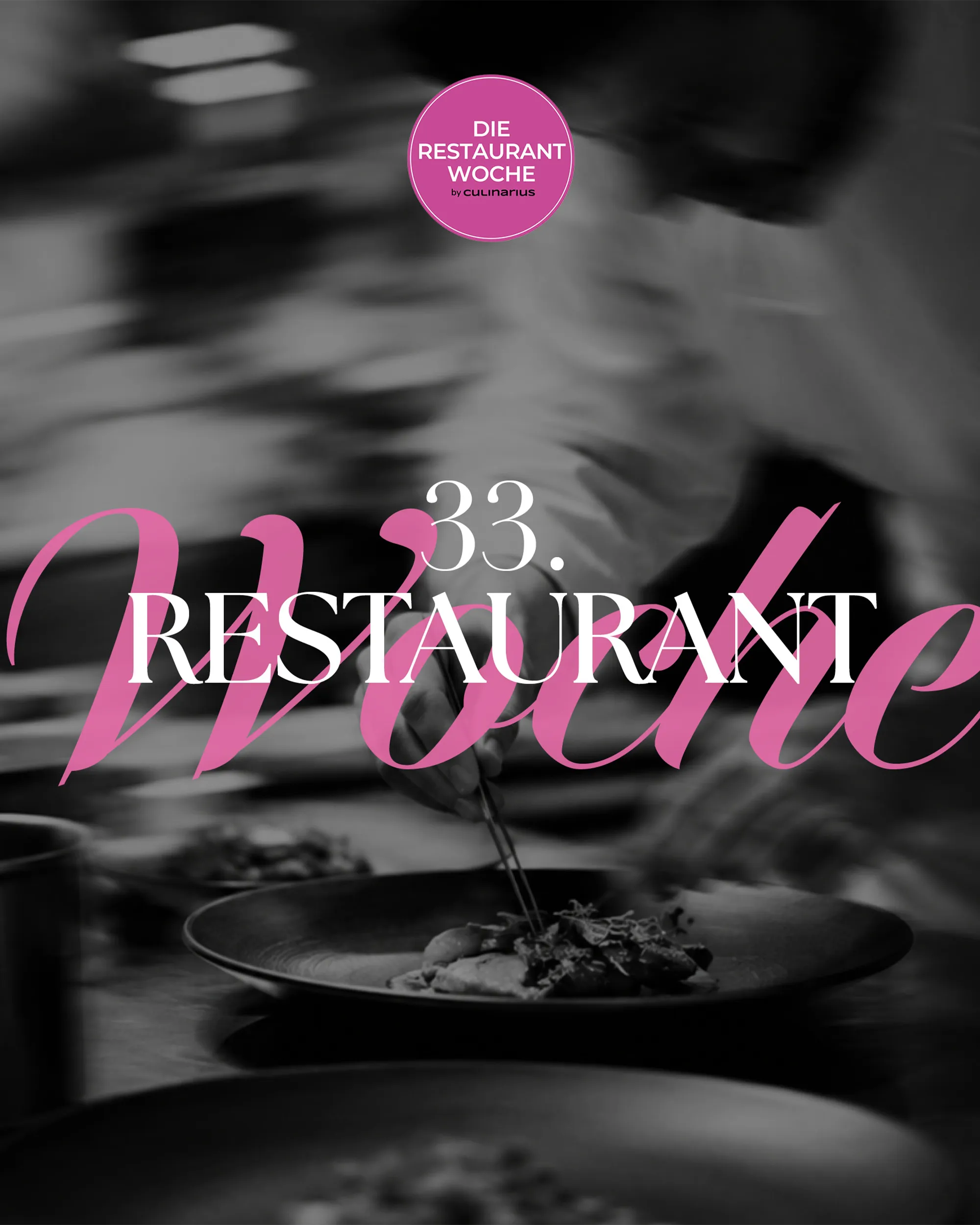
  • Schwarz-weißes Foto eines Kochs beim Anrichten mit dem Schriftzug Die Restaurantwoche, Web-Projekt von OSTWERK

    [WEB][TECHNOLOGY & MEDIA]

    Die Restaurantwoche

    Ausgangslage
    Viele Gäste sollen in einer Genusswoche gleichzeitig reservieren, ohne Doppelbuchungen.
    Ergebnis
    Eigenes Reservierungssystem mit Frühbucher-Logik, Mails und SMS, drei Editionen seit 2025.
    Case ansehen: Die Restaurantwoche
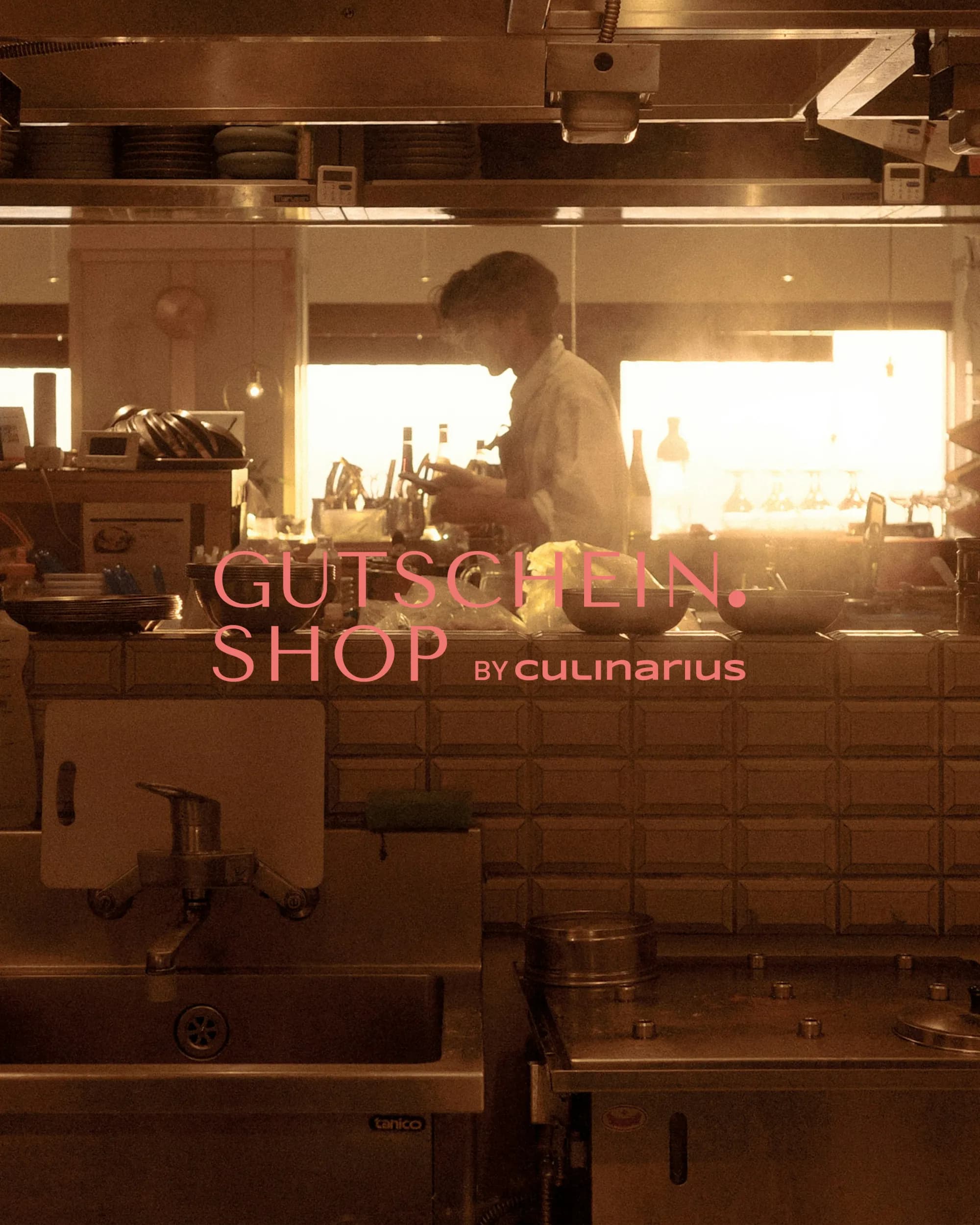
  • Koch in einer Restaurantküche im Gegenlicht mit dem Logo Gutschein.Shop by Culinarius

    [WEB][TECHNOLOGY & MEDIA]

    Gutschein.Shop

    Ausgangslage
    Ein laufender Gutscheinshop braucht Stabilität und eine Struktur, die in der Suche gefunden wird.
    Ergebnis
    Übernahme und Betreuung seit Oktober 2025, neue URL-Struktur nach Region und Gutscheinart.
    Case ansehen: Gutschein.Shop
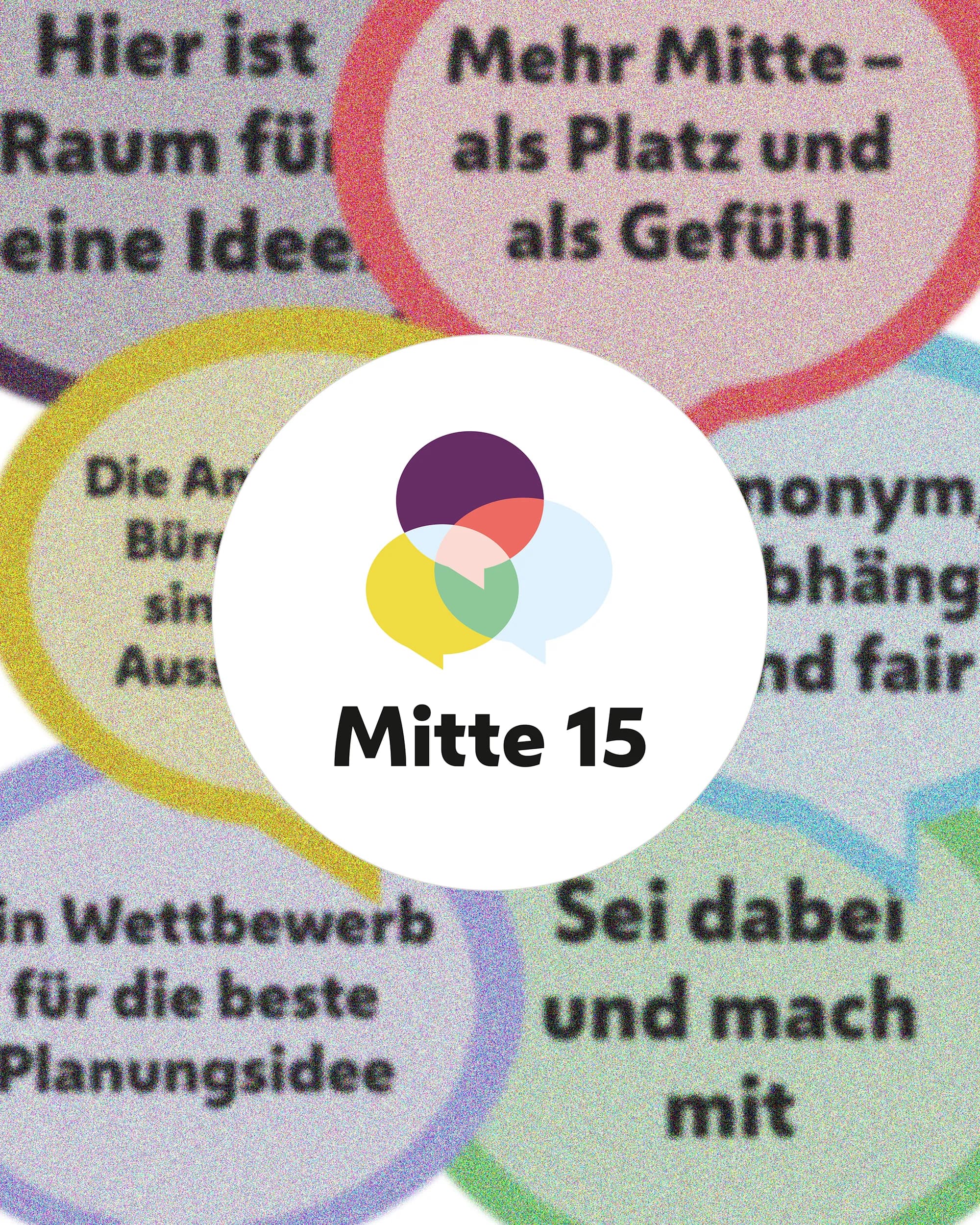
  • Bunte Sprechblasen mit Beteiligungsaussagen um das Logo von Mitte 15, Web-Projekt von OSTWERK

    [WEB][PUBLIC & INSTITUTIONS]

    Mitte 15

    Ausgangslage
    Wettbewerb und Beteiligung sollen für alle Bewohner:innen verständlich und auffindbar sein.
    Ergebnis
    Statische Projektwebsite mit CMS, laufend betreut, dazu Print-Material für den Auftakt.
    Case ansehen: Mitte 15

Next step

A brand for something that does not exist yet?

Tell us what should be created. We reply within 24 hours.