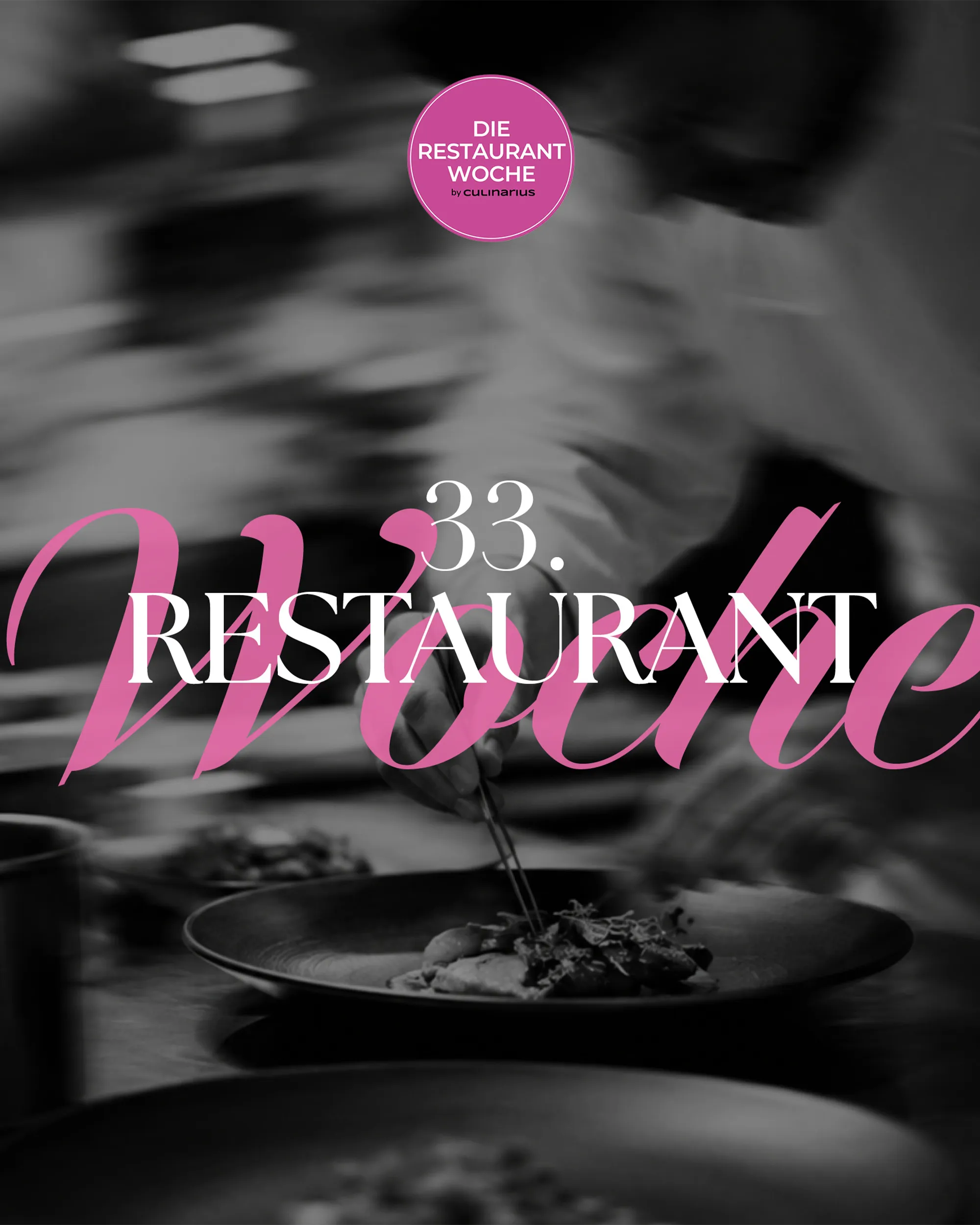
Die Restaurantwoche
- Ausgangslage
- Viele Gäste sollen in einer Genusswoche gleichzeitig reservieren, ohne Doppelbuchungen.
- Ergebnis
- Eigenes Reservierungssystem mit Frühbucher-Logik, Mails und SMS, drei Editionen seit 2025.

Reference: branding for a consultancy
Mint Waters is the consultancy of Emir Selimovic for agencies, SMEs and B2B start-ups. OSTWERK developed the brand in 2023: naming, logo, typography, colour palette, imagery and wording, plus a brand book.
A project by OSTWERK, digital agency in Vienna.

At a glance
A brand that expresses clarity, modernity and dynamism, with a drop as its mark and a colour palette between lilac and aqua.
Starting point
What we delivered.
Build
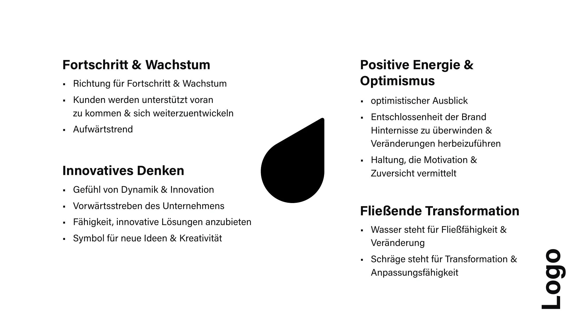
Water stands for fluidity and change, the slant for transformation and adaptability. The drop sits in the logo as a dot and stands for progress and growth.
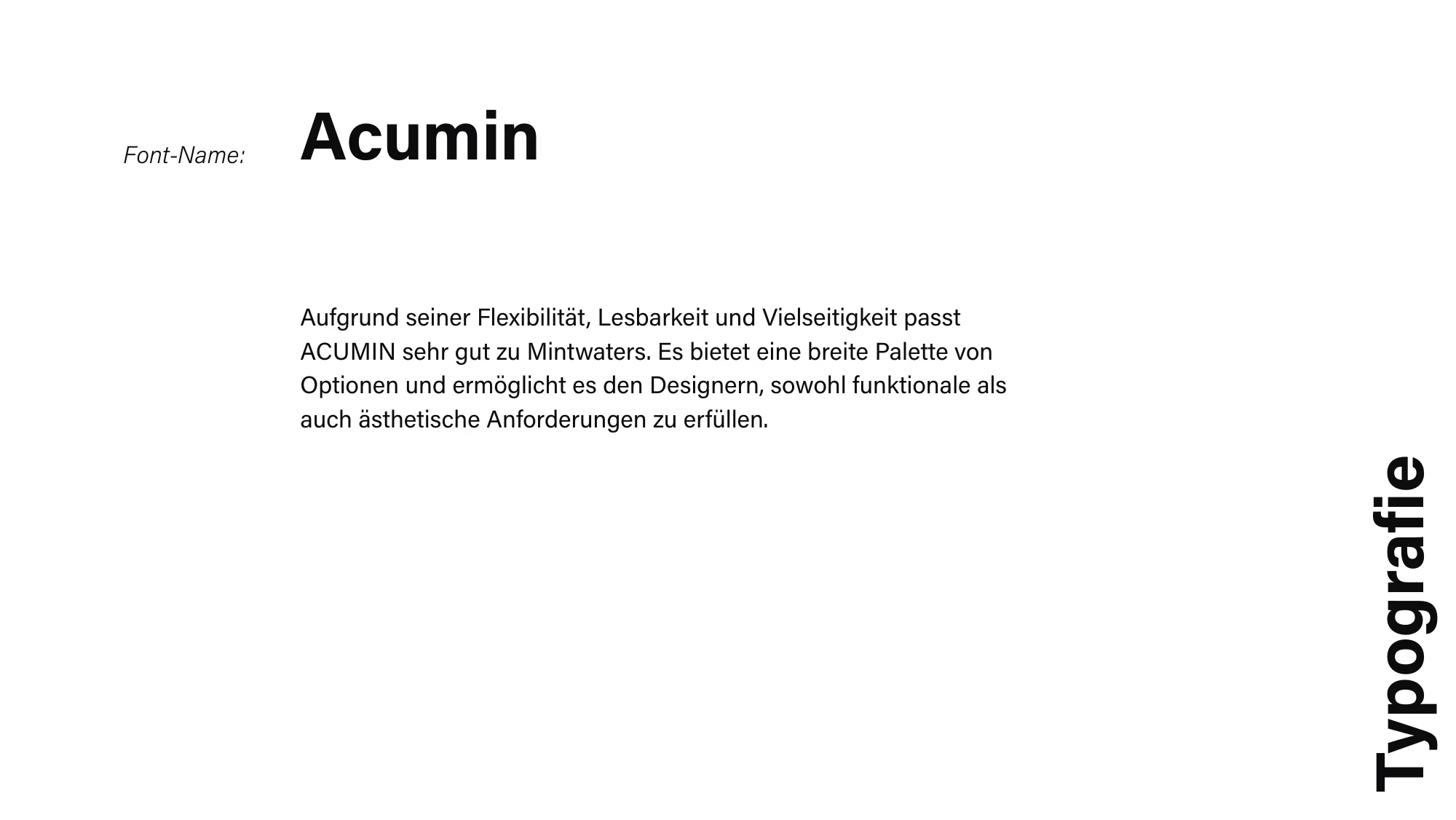
Neo-grotesques are considered neutral and modern. Acumin offers many weights and widths and is highly legible, in body text as in headlines.
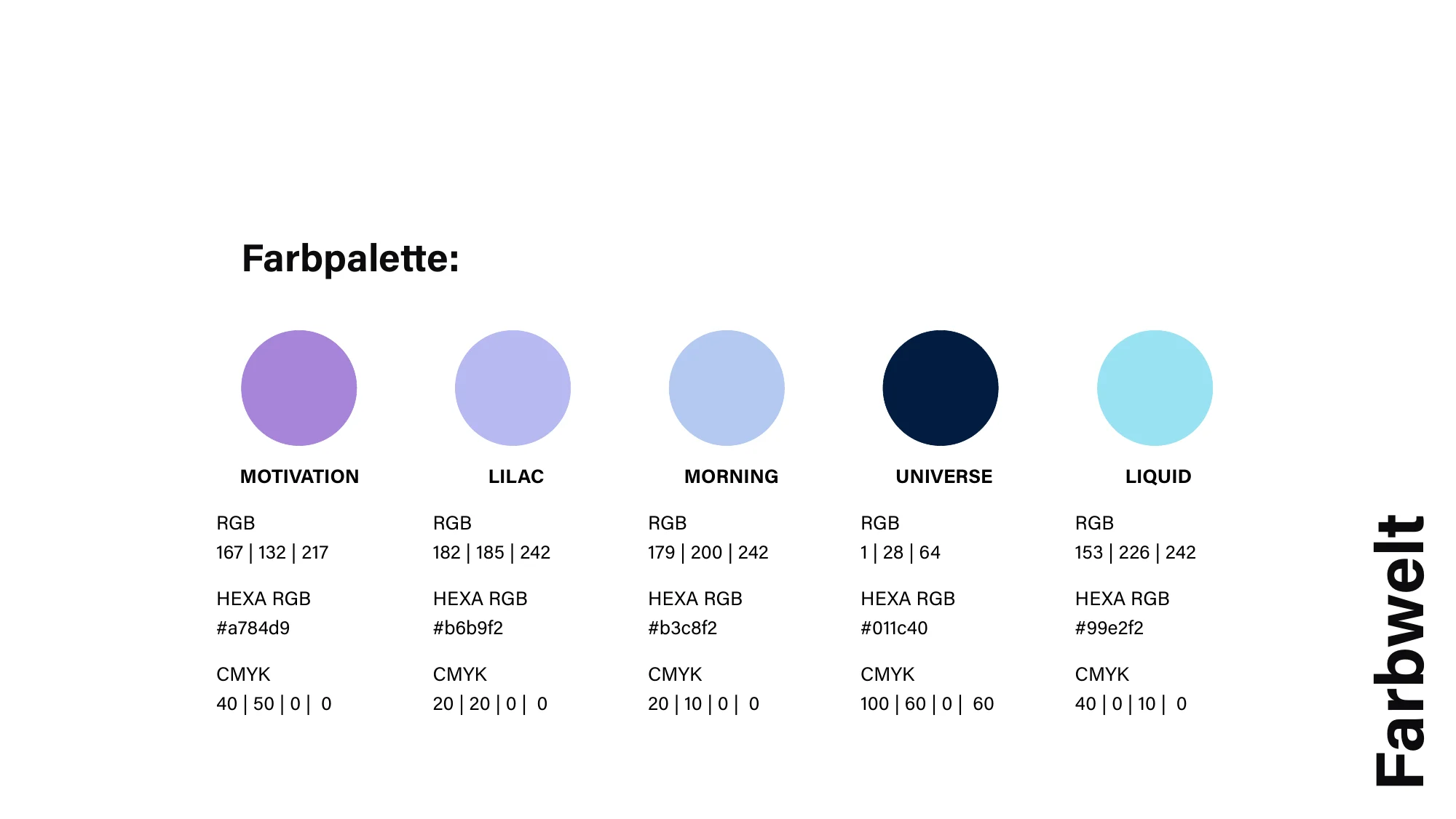
Lilac stands for creativity, innovation and uniqueness and makes the brand unmistakable among competitors. Navy gives support, aqua brings freshness. Every colour is documented with RGB, HEX and CMYK.
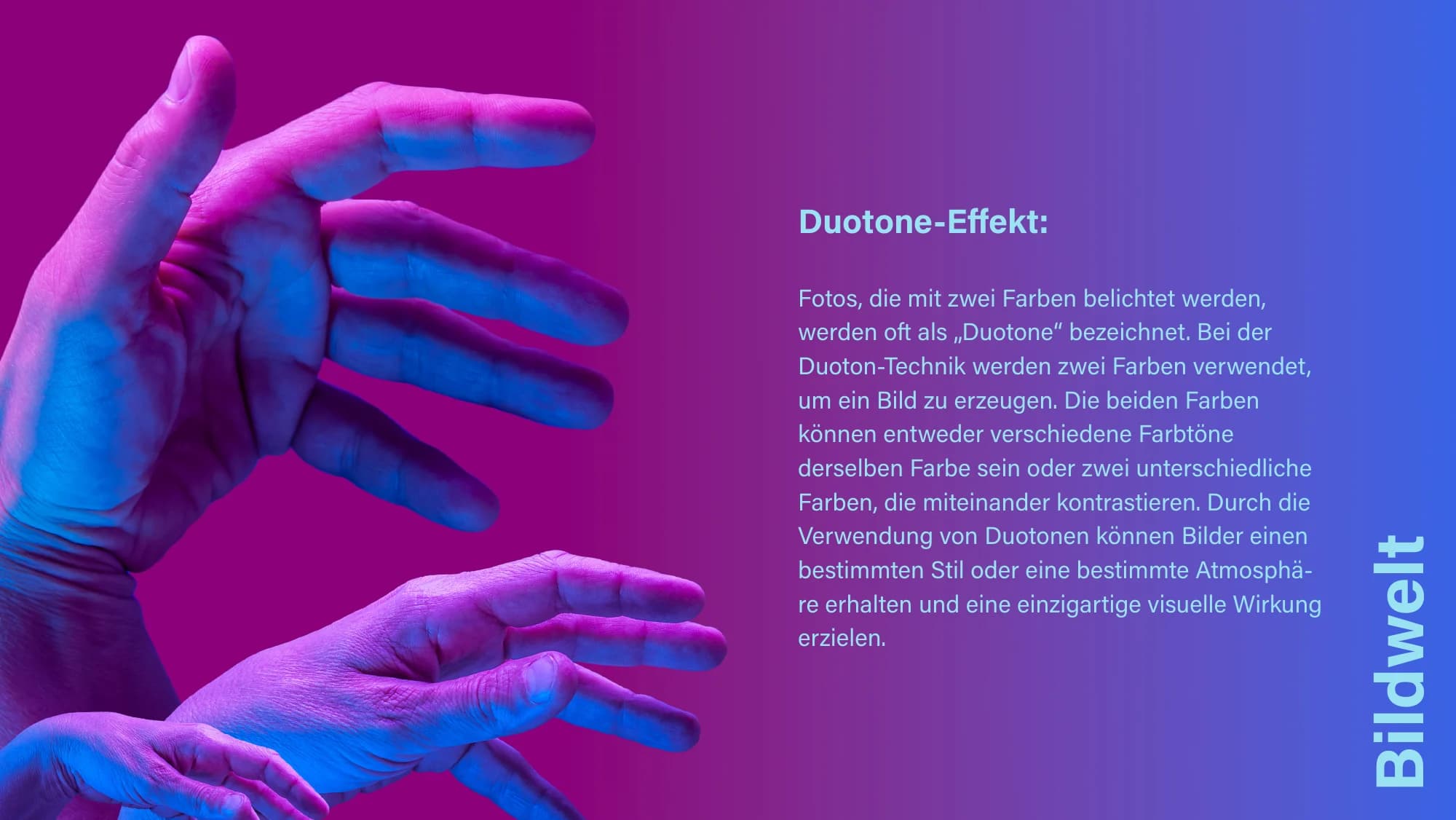
Photos in two colours give the brand its own style. People look into the camera and show authenticity, competence and closeness.
Project timeline
The brand should convey trust, innovation and active collaboration. From this came the image of a clear horizon.
The derivation of the name and the logo with the drop set the core of the brand.
Acumin, the colour palette and the duotone imagery make the brand visible.
Guidelines for language and application hold everything together in one brand book.
Result
Since 2023 Mint Waters has a brand system that holds mark, typeface, colour, image and language together.
FAQ
OSTWERK developed the brand in 2023: naming, logo, typography, colour palette, imagery and wording, plus a brand book.
Water stands for fluidity and change. The drop also stands for progress, growth and innovation.
Acumin is a neutral, modern neo-grotesque with many weights and widths. It is highly legible and fits the brand's clear look.
The derivation of the name, the logo with proportions, the typography, the colour palette with colour codes, the imagery and guidelines for wording and tone.
More references
3 Projekte
Next step
Tell us what it is about. We reply within 24 hours.